“I wish there were volunteer opportunities where I could use my skills and experience.”
persona
Jonathan
25 | BA student
Problem statement:
Jonathan is a working student who needs to find volunteer opportunities where he can use his skills and experience because that is what motivates him to volunteer.
Goals
Find volunteer opportunities where I can use my skills and experience.
Volunteer with friends and family.
Frustrations
“It’s hard to stay motivated to volunteer when the time spent feels wasted.”
“Being acknowledged and hearing that my contribution is valued is important to me.”
“I’ve never volunteered because no one asked me, but I would volunteer in fun opportunities or activities related to my hobbies.”
persona
Abeer
29 | Accounting | Salesman
Problem statement:
Abeer is a full-time employee who needs to find enjoyable volunteer opportunities where he can also make new relationships because he wants to have fun in his spare time.
Goals
Find out what volunteer needs exist in my community.
Have a fun time volunteering.
Meet new people.
Frustrations
“I don’t know what are the volunteering needs in my area.”
“I find it difficult to commit to activities that are not enjoyable.”
“Working long hours and being single makes me feel lonely sometimes.”
Competitive audit
A review of competitor products was conducted to identify what’s currently available to users and what is lacking.
Key gaps identified include:
Outdated and unintuitive user interfaces
Lack of personalization features
Failure to address users’ motivations for volunteering
Click to zoom
Starting
the design
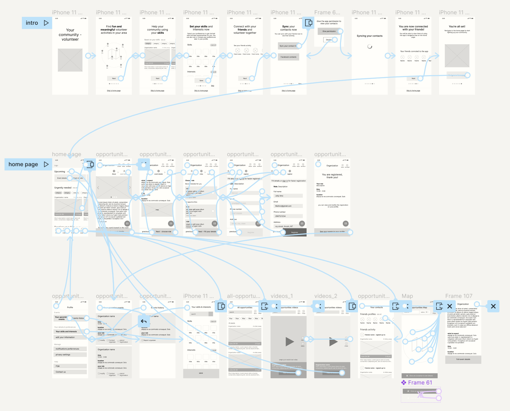
Sitemap
A sitemap was developed to structure the app’s content and ensure clear, cohesive navigation throughout the user experience.
Click to zoom
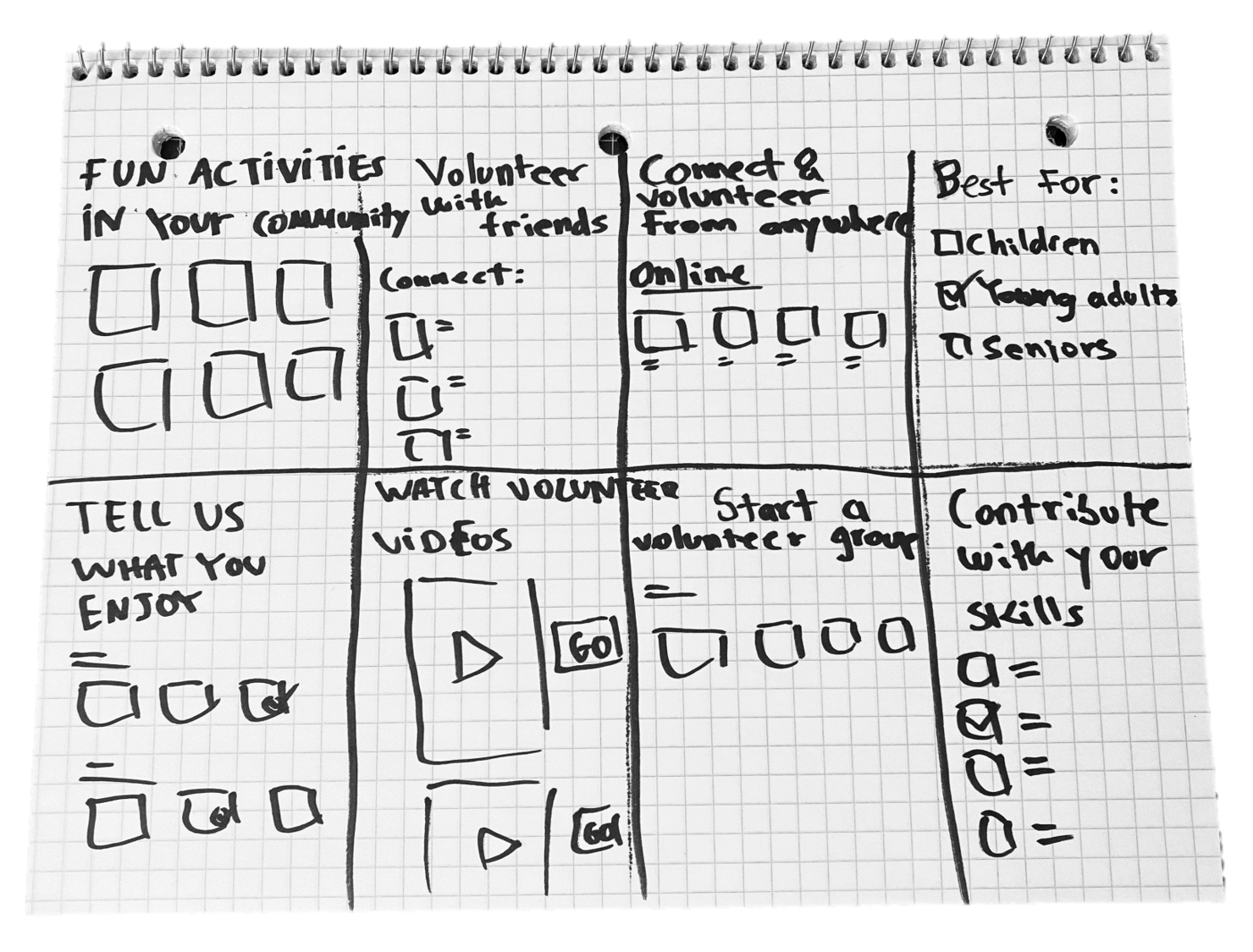
Ideation - Crazy 8's
I kept the research in mind and focused on the factors people said would motivate them to volunteer, including :
Having fun
Meeting friends
Finding opportunities aligned with skills and interests
Low-fidelity prototype
To prepare for usability testing, I created a low-fidelity prototype that connected the user flow of signing up for a volunteer opportunity.
People expected to see more options such as adding their name and location in the begging, and adding skills based on keywords.
Videos
People were not sure what types of videos they would see.
Redundant content
People felt that content was unnecessarily redundant on the home page and navigation bar.
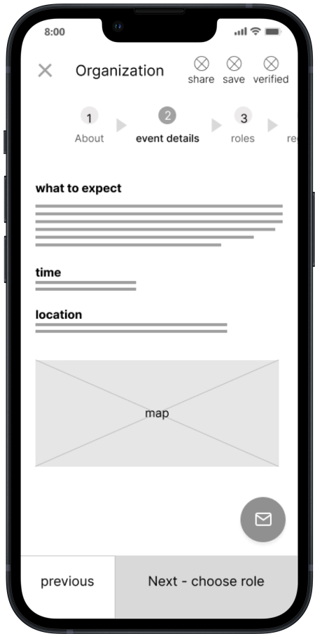
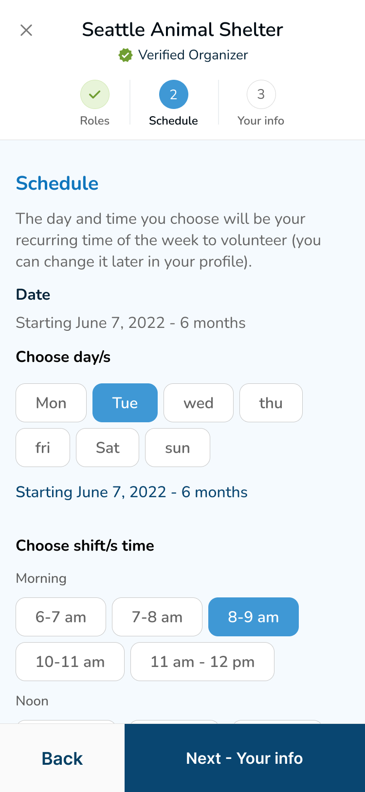
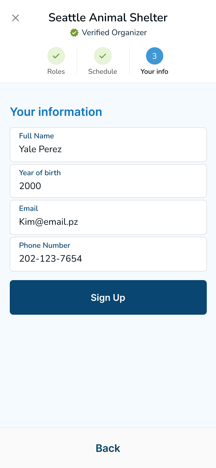
Registration flow
People were confused about the About page and wanted more details about the schedule.
Refining the design
Mockup: registration
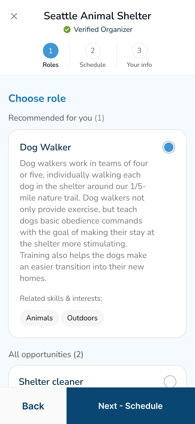
Based on the insights from the usability study, I made changes to improve the user experience.
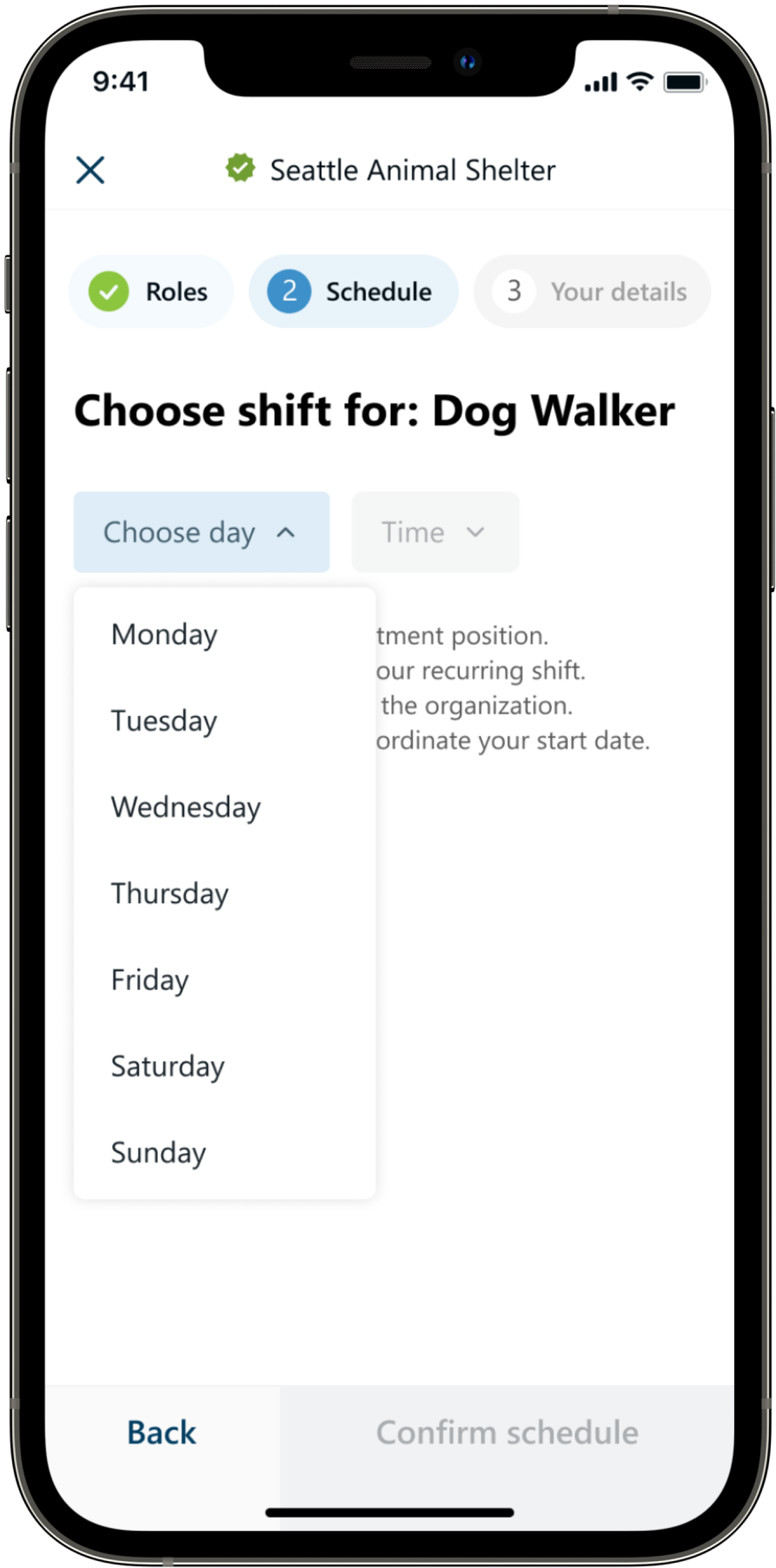
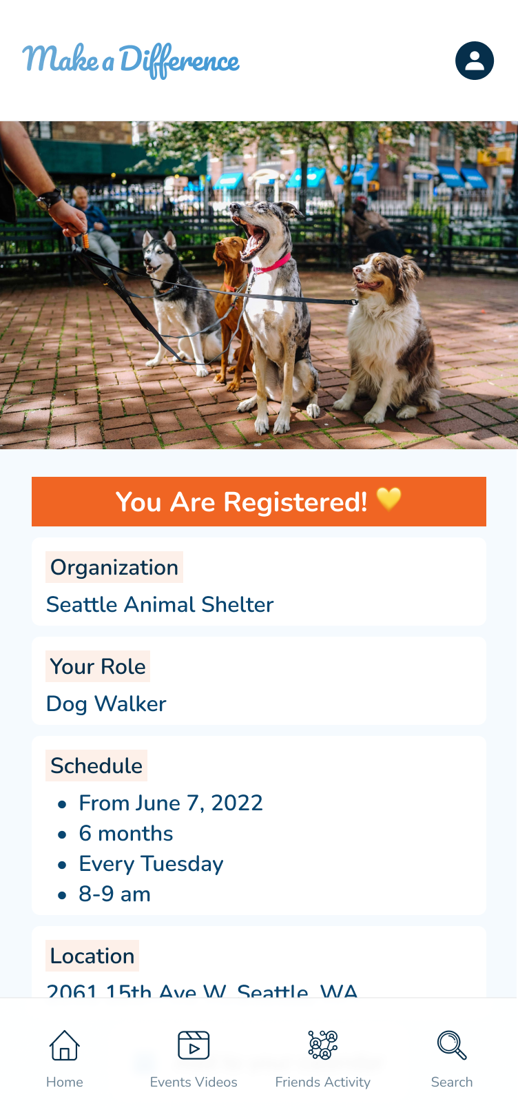
One of the changes I made was reorganizing the registration flow and adding a screen for choosing the schedule.
Before
After
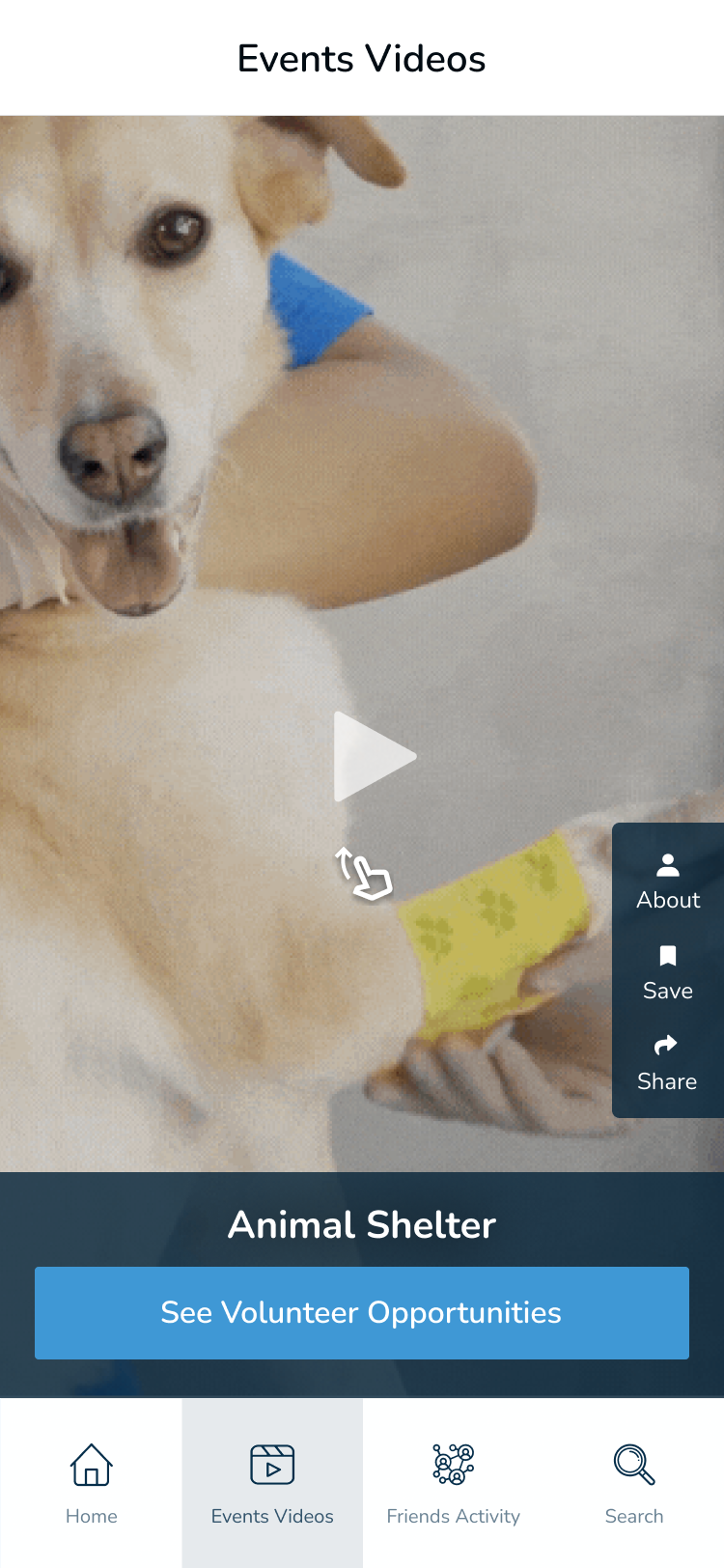
Mockup: videos
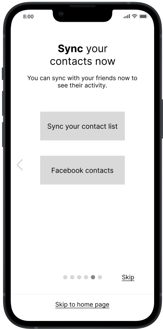
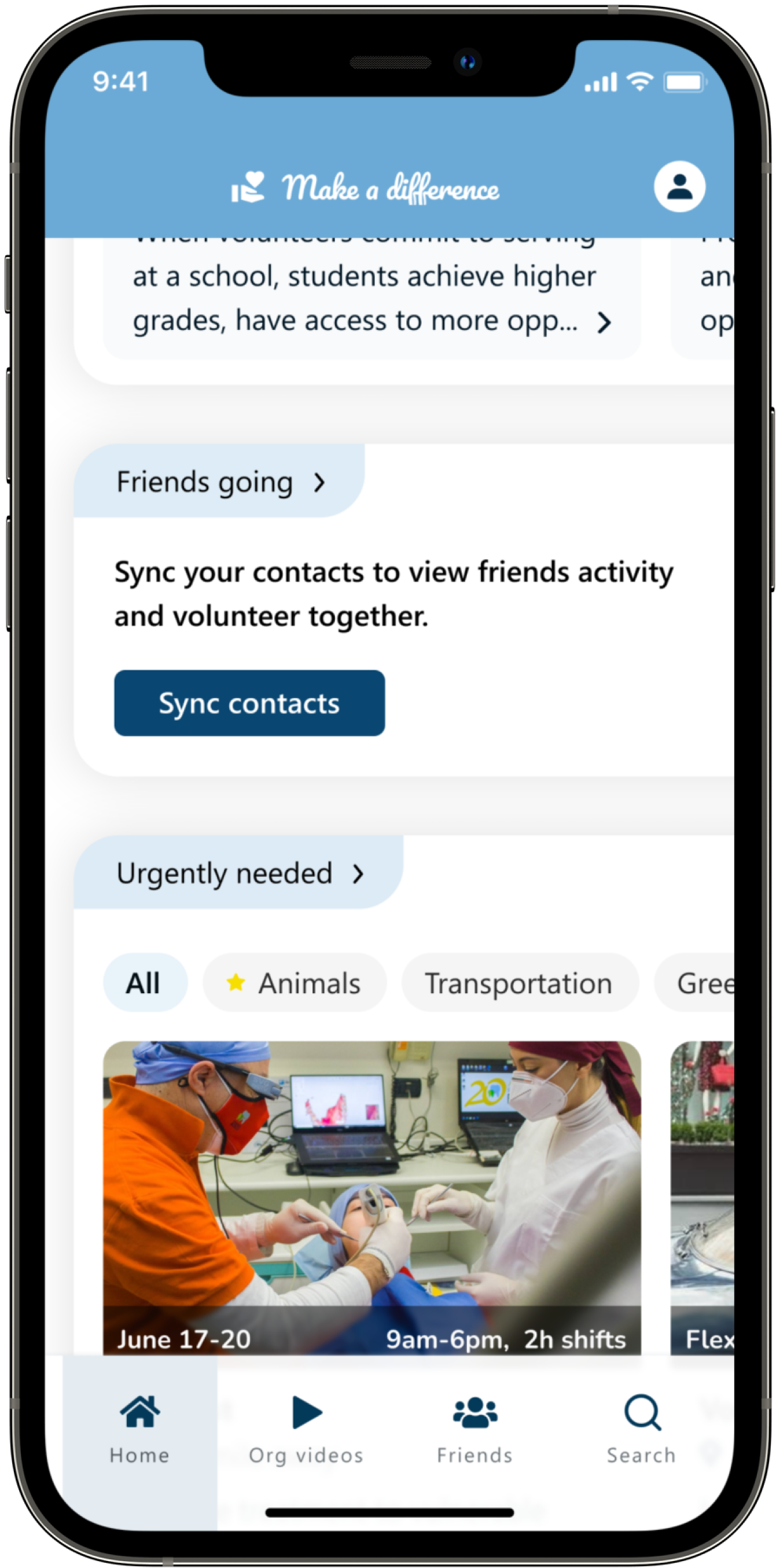
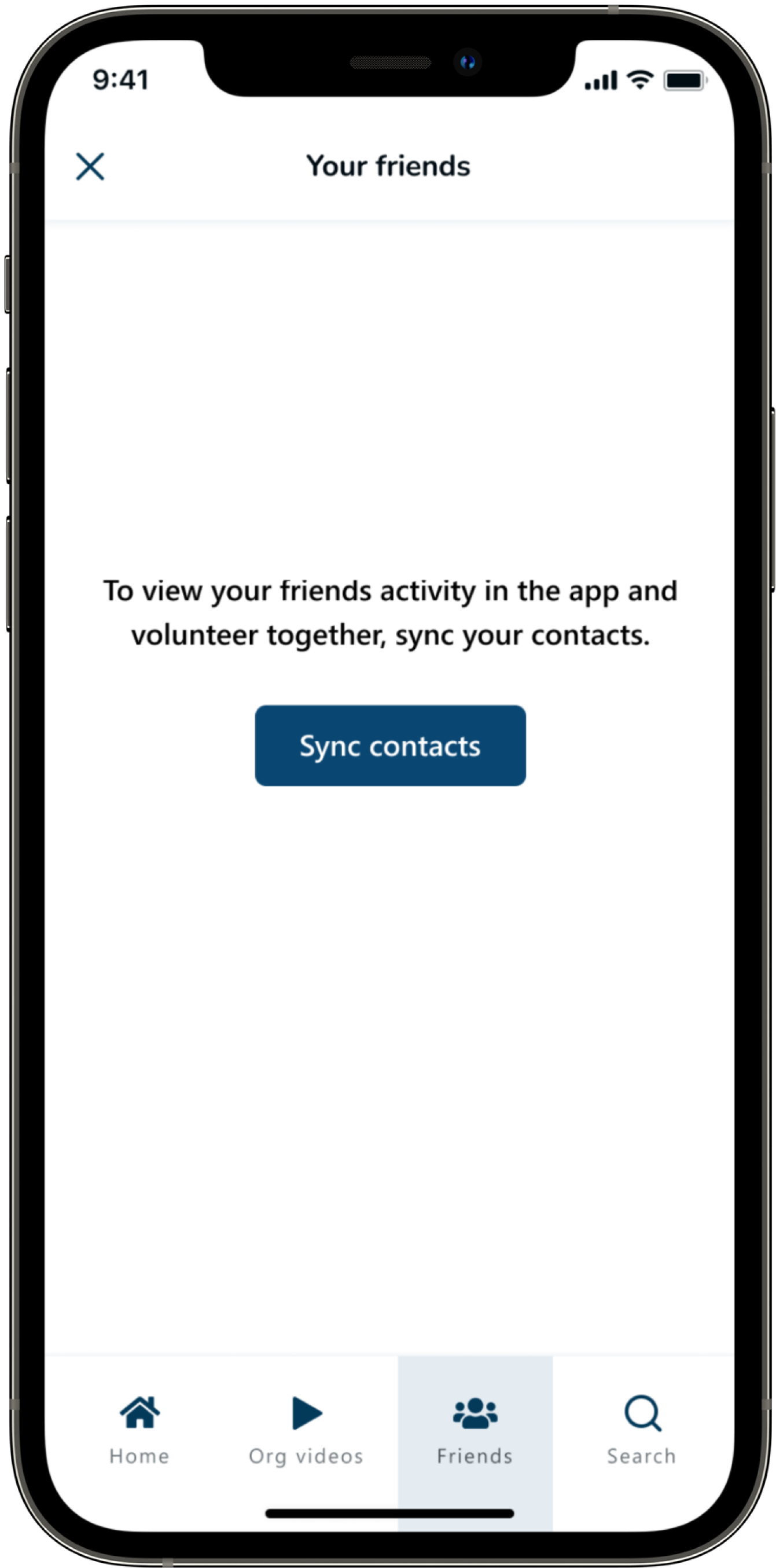
The usability study also revealed that people did not want to sync contacts before trying the app. So, I removed the sync screen from the intro flow and added the option for users to sync friends from the home page and friends page.
Before
After
Mockups
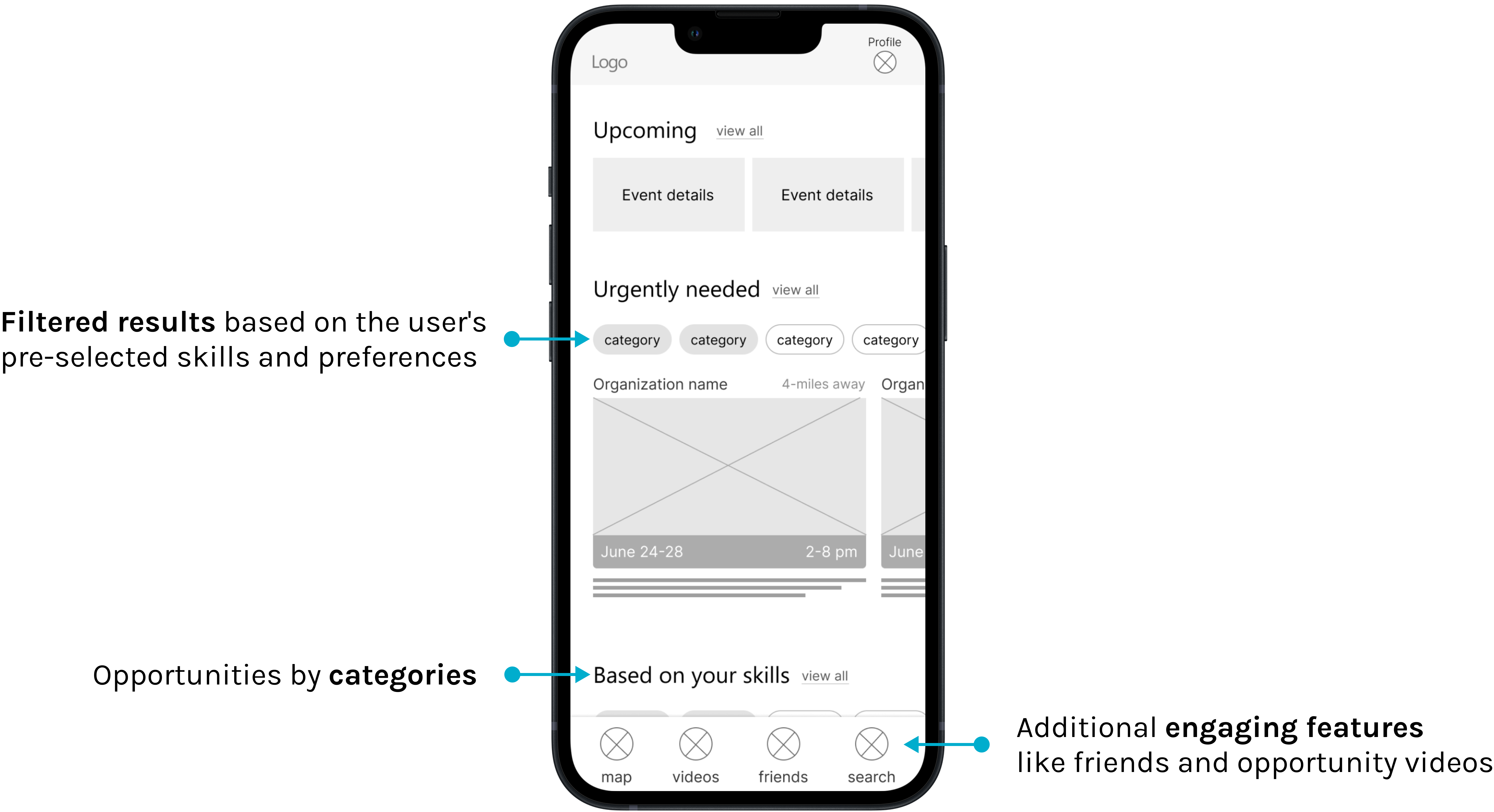
High-fidelity prototype
The high-fidelity prototype followed the same user flow as the low-fidelity prototype and include the design changes made after the usability study.
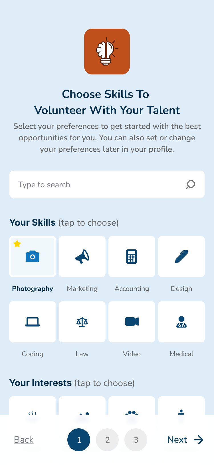
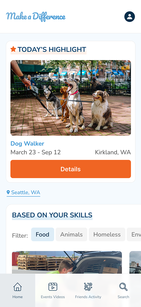
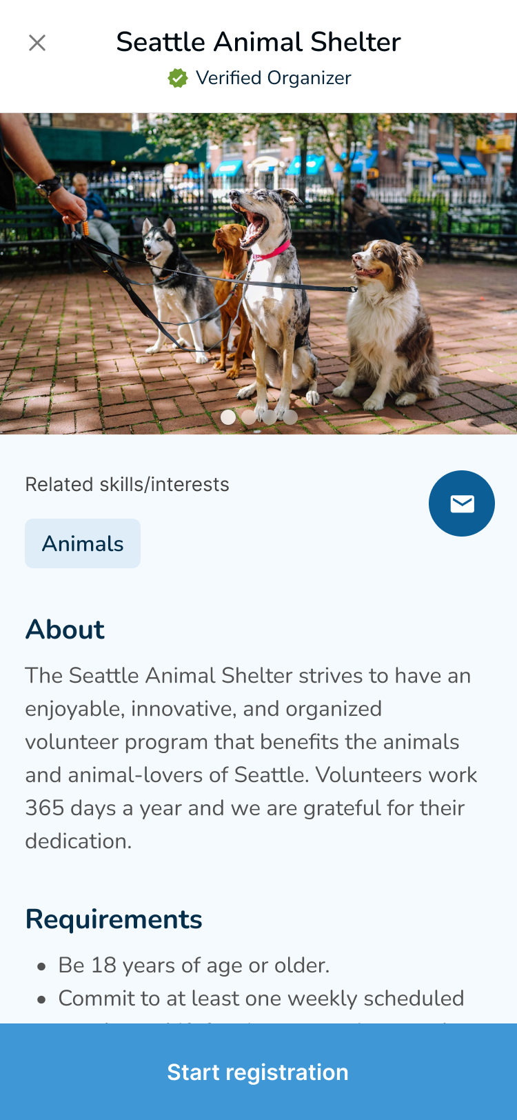
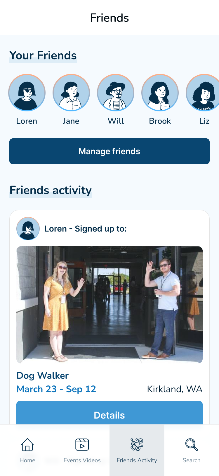
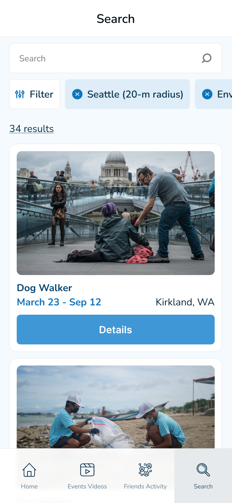
Users can set preferences and filter results to view accessible and remote opportunities.
Headings & labels were used to organize the content and support assistive technologies.
Color combinations with enough contrast were used so the content is easy to read.
Going forward
Takeaways
Impact:
Users shared that the app made them more motivated to seek volunteer opportunities in their communities after seeing that the app could be tailored to their needs, interests, and skills.
What I learned:
This was my first project using external secondary research. I experienced firsthand how time efficient it is while still providing quality data. This was also an opportunity to practice empathizing with users despite not having direct interaction with them prior to usability studies.